Website Design:
Tile 1:
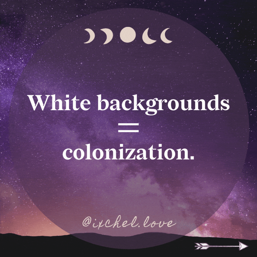
White backgrounds = colonization.
Tile 2:
Make your websites (and slide decks) darker background colors. This reduces energy usage and helps the device last longer.
Tile 3:
Lower your screen brightness by 50% to help it last twice as long.
Tile 4:
Reducing screen brightness decreases manufacturing which reduces mining of resources in the future (colonization).
Tile 5:
Turn your devices and apps to Dark Mode.Ask app developers to upgrade to Dark Mode.
I’m looking at your New York Times, Mighty Network, Clubhouse, LinkedIn…
Tile 6:
Colonization is actively happening to the Indigenous and the Land today.
Tile 7:
If you’re reading this, you participate in colonization. We all are. When we know better, we can do better.
Tile 8:
What comes up when you think of shifting a habit? We hope this series sparks a dialogue! Follow us for more decolonial shifts!
(please Like, Comment, Save, and Share)
WTF is a Colophon?
Oxford defines:
col·o·phon /ˈkäləfən,ˈkäləˌfän/ /noun/
1. a publisher’s emblem or imprint, especially one on the title page or spine of a book.
* HISTORICAL
2. a statement at the end of a book, typically with a printer’s emblem, giving information about its authorship and printing.
The website specifically uses dark backgrounds in order to conserve power (especially on OLED mobile devices which account for 50%+ of my traffic). #climatereparations #usedarkmode
According to the International Energy Agency, “Global internet traffic surged by almost 40% between February and mid-April 2020 during the height of the Covid-19 containment measures, driven by growth in video streaming, video conferencing, online gaming, and social networking.The International Energy Agency reports that data centers consume approximately 200 terawatt-hours (TWh) of electricity, or nearly 1% of global electricity demand, contributing to 0.3% of all global CO2 emissions.”
Insaf Ali writes on Medium, “According to a report by the Natural Resources Defense Council, data centers in the United States alone used up 91 billion kilowatt-hours of electricity in 2013. It would take 34 relatively large coal-fired powered plants to generate that much energy.”
White backgrounds use significantly more energy on our device screens which also age faster when displaying bright pixels. Reducing power and device-aging saves money, people and ecosystems by buying devices less often.
More energy use means more colonization. If we consume less energy and buy electronics less we will borrow less from our future and cause less harm now — less outsourcing of entropy (h/t #tysonyunkaporta).
Remember entropy is a universal non-negotiable. Entropy happens. The result of entropy on Earth is the irreversible change of matter (energy) from order to disorder.
Natural systems hold Deep Time in stasis to protect energy from entropy through regeneration.
Physicists like to think that entropy increases over Time. But actually, available Earth Time is decreasing when entropy occurs. This is what Indigenous ways of knowing teach us. Regenerative traditions protect natural systems.
We are outsourcing entropy through the creation of resource-heavy electronics. Our technology is borrowing from our future generations’ resources. While we haven’t discovered how to live tech-free in this age of information, we can stop stealing life from our grandchildren by using tech responsibly. Let’s not pretend these devices or the resources they consume just happen magically.
White backgrounds = colonization.

This video shows how the font becomes more bitmapped. “In reviewing historical source material, the team observed varying states of typographic degradation in the text of countless [legal] documents. As files were faxed, photocopied, and otherwise reproduced, the letterforms became bitmapped, bloated, warped, and were sometimes reduced to near-illegible forms.”

Headline Font: Redaction Bold Italic 2.2em
Body Font: Lato, 1.4em, 300 weight
Website Fonts
In April 2021, I purchased a @canva template and then went to town on it to prepare my handbook and presentation slidedeck for the upcoming @thrivercon summit.
As a Human Design profile of 4/1, Manifesting Generator with a strategy of responding, I like starting from someone else’s design bones and then customizing (this helps me drop into Flow states much faster).
As a former brand designer and web developer, writer, letterpress publisher, etc., fonts are usually where I would begin, they set the feeling of the work. I’d actually gone back and forth about using the template font, Redaction, because I wanted to use my existing brand font, Mr. Eaves Sans Bold Italic for the headlines. But, there was something I really liked about Redaction. And I didn’t recognize the name. I fell down a timely rabbit hole at the intersection of Black bodies, the justice system and art. When I read about it’s origin I just started balling. Now I’ve completely fallen in love with everything about it.
“Redaction — a multiplicity of typographic, legal, and human histories.”
Redaction font was a blend of the government and court systems standards (Times New Roman and New Century Schoolbook) with the sentiment of Eaves as a point of conversation about everything wrong with justice system. So, yeah, I’m completely moved and adopted Redaction as my new headline font as continued protest in JEDI justice.
As a former brand designer and web developer, writer, letterpress publisher, etc., fonts are usually where I would begin, they set the feeling of the work. I’ve been using Mr Eaves Sans bold italic for website headlines for a bit now (I used Mrs. Eaves all.the.time when I designed letterpress wedding invitations at Dauphine Press back in the day. I love Emigre Foundry and the female font designer Zuzana Licko, she’s a Czech immigrant out of Berkeley. I had a love affair with her Filosophia when it was released in 1996 (I was an undergrad at Mills College back then).
From redaction.us website:
*Redaction — a multiplicity of typographic, legal, and human histories.* Redaction is a bespoke typeface commissioned by Titus Kaphar and Reginald Dwayne Betts ’.
The Redaction exhibition at MoMA PS1.
As part of a timely conversation at the intersection of history, the legal system and social justice, the fonts will be free for personal use. In a spirit of generosity, the artists invite everyone to broaden the ethos of the exhibition by making these tools accessible to a global and engaged audience.
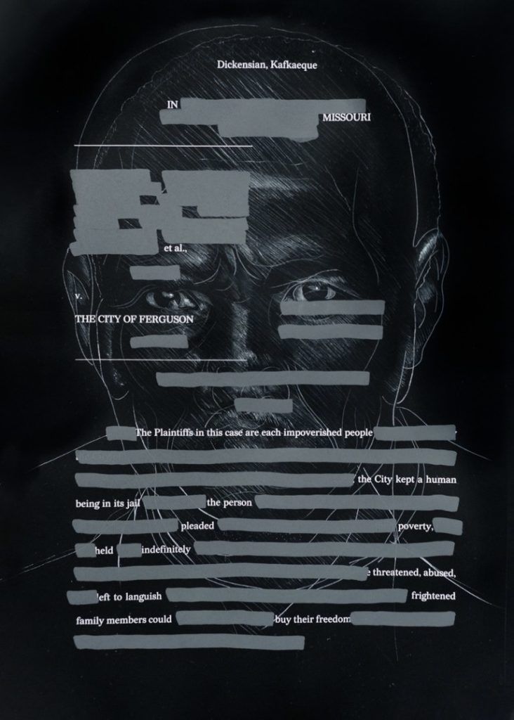
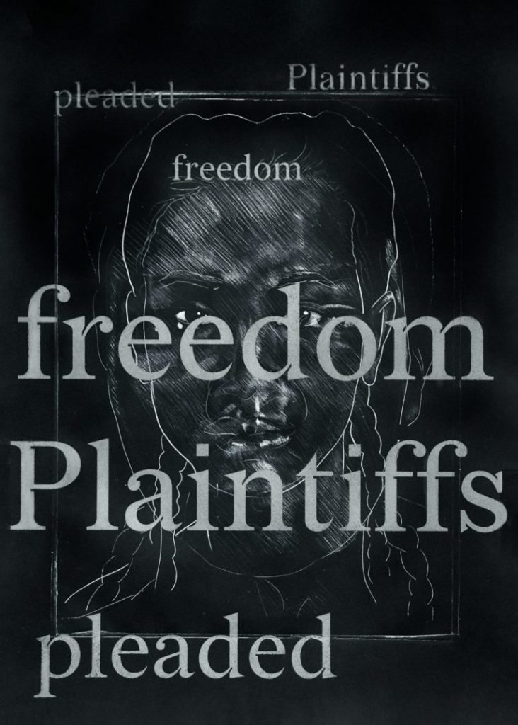
The Redaction project seeks to highlight the abuses in the criminal justice system, in particular the way poor and marginalized people are imprisoned for failure to pay court fines and fees. When Titus Kaphar and Reginald Dwayne Betts began their collaboration on The Redaction, they identified that typography should be an important extension of the work.
Using legal documents from claims filed by the Civil Rights Corps as source material, Betts crafted new poems by redacting out superfluous information – text that is juxtaposed with Kaphar’s portraits of the individuals represented in the claims.
This emphasis on text and legibility presented a unique design opportunity: to create a bespoke typeface that could be used in the work, and also serve as a scalable tool to raise awareness of the project and reach even more people. To fulfill the typographic potential of the project, Kaphar reached out to Forest Young, a colleague from Yale, now a Global Principal and Head of Design at Wolff Olins, who in turn recruited Jeremy Mickel, type designer and owner of MCKL.
The first phase of the project consisted of research and immersion. It was imperative to learn as much as possible about the history and nature of legal documents, and the various approaches to redaction. Unsurprisingly, the designers found a spectrum of redaction: forms extending beyond the simple black box — an incomplete redaction; stamps marked ‘deleted’ but not obscuring the text; white boxes that appeared to invite the user to fill in their own text, and ad hoc handmade notations, among others.
Specifically, the team noted that the vast majority of legal documents in the United States followed a set convention of using Times New Roman. The United States Supreme Court, however, dictates that all documents must be set in New Century Schoolbook. Both typefaces felt default, functional, and familiar. While they do not call attention to themselves at small size, they still command a sense of authority — attributes which the team hoped to emulate in their own design.
In reviewing historical source material, the team observed varying states of typographic degradation in the text of countless documents. As files were faxed, photocopied, and otherwise reproduced, the letterforms became bitmapped, bloated, warped, and were sometimes reduced to near-illegible forms. This particular aspect of variable legibility inspired subsequent experiments for future iterations of the fonts.
Times New Roman and New Century Schoolbook became the foundational pillars of legal typographic influence. The first goal was to draft something which simultaneously embodied both typefaces. While early tests of hybridization proved successful, the letterforms lacked a desired immediacy and contrast that could elevate them to both the abstract and conceptual, and ultimately be worthy of being incorporated into Kaphar and Betts’ work.
An early point of inspiration was the United States presidential seal, which depicts an eagle grasping arrows in one talon and an olive branch in the other. This was embraced as a potent metaphor for the extremes in the legal system: cruelty and compassion, war and diplomacy, hard and soft, white and black. This logic was then applied to the letterforms: teardrop shapes became supple and round, while acute shapes became razor sharp. When this exaggerated contrast resulted in an amplified tension, the team knew they were on the right track.
Pushing ahead, the team looked back at the early bitmap studies and document references and wondered if they could synthesize those details into the the font. By incorporating negative shapes into the letterforms, the. typeface could hint at the digital artifacts created through reproduction in fax machines and photocopiers. Peter Saville’s Power, Corruption, and Lies album cover for New Order served as additional inspiration; the unassuming color bar on an otherwise mundane floral still life effortlessly merges contemporary and historical narratives. A pixel fit nicely into the joins on characters like H E, but required bending and shaping to be convincing on the n s. Through trial and error, the letterform design followed an “inktrap logic” — to place negative shapes into as many of the glyphs as possible, with the additional pixel detail of a square tittle for the i dot and period.
It was always the hope to include bitmap grades of the font in order to reference the degradation of documents as they are reproduced through the legal process. As contemporary design moves through a zeitgeist of pixelation, with many incredible examples online, the team recalled the landmark designs by Susan Kare for the original Apple Operating System and many of Zuzana Licko’s early digital fonts for Emigre. The team maintained a conceptual framework for the degraded versions; it’s decidedly not merely an aesthetic.
By providing a range of grades from subtly analog to nearly illegible, the typeface nods to the transformation and marginalization that many people face in the criminal justice system today, and specifically, the role and responsibility of the author of text to be conscious of legibility as a signature of power.”
Web Host: WP Engine
I’ve been using WP Engine since 2012 and I don’t recommend any other host for WordPress. I have the WP Engine – eCommerce Startup Plan. Because it’s a managed plan you’re secure:
- Daily automatic backups.
- Reminders to upgrade WordPress (with auto-upgrades).
- Warnings if you plugins have been found to be vulnerable.
From WP Engine: Our people fuel the engine.
We’re a diverse and inclusive set of people brought together by our shared purpose and values
66%
of our leadership team are women.
30%
of our of our employees do not have a college degree.
33%
of our employees are people of color.
8%
of our of our employees identify as LGBTQ.
Website Content Management System: WordPress
In over 25 years of web development I’ve seen a lot of web management platforms come and go. And I’ve designed on many of them. WordPress made my life much less stressful in building beautiful websites that didn’t break with weird browser updates.
Website Templates: Funnel Gorgeous for Elementor
I have been using Funnel Gorgeous templates for sales pages and assets for some of my design. I customize them quite a bit, so they don’t really look like templates. I use Elementor Pro to run the themes. I have grown to like Elementor, and will likely keep my site pages and blog on Elementor. I previous used a different theme that left code snippets all over my blog pages. I have yet to clean it all up. It will be an ongoing effort. Apologies for the mess. It’s on the to-do list for a new-hire.